

There a myriad of options for creating charts using python/ java script. One of my personal favorites is bokeh. It allows for a lot of customization, plays pretty well with flask and weazy print and provides interactivity right out of the box with its javascript library.
Recently I needed an easy way to at a glance determine if all the resources available for a given type of task are used uniformly. Meaning that at the end of the year one resource has not been used significantly more than another. For example if we had a fleet of pizza delivery vehicles we wouldn't want one to be used more than another. I care about both about how much its being used every day and over a certain time period.
There are plenty of options on how to visualize this data. The most obvious being a stacked histogram, however I wanted something that would be easy to explain to any person. Hence the idea of a stacked circular/ pie plot creation. Something almost like https://docs.bokeh.org/en/latest/docs/gallery/burtin.html. Plotly does have a windrose plot that works well but I prefer to use bokeh for my plots.
We start out making sure that we have bokeh installed
pip install bokeh
The main component we will be using is bokeh's annular wedge. First we need to get some data so this will look like the following. With each value representing the amount of deliveries each vehicle performs in a week.
a1=[10,15,6]
a2=[9,8,18]
a3=[0,24,5]
a4=[12,16,5]
a5=[13,13,13]
a=[a1,a2,a3,a4,a5]
We have to import the libraries we will be using, in this case there we only need figure and show from bokeh.plotting and pi value from numpy (and possibly output_notebook from bokeh.io if using a jupyter notebookm or export_png to save figures).
from bokeh.plotting import figure, show
from numpy import pi
To define an annular wedge we need to provide the following
p.annular_wedge(x_coord,y_coord,inner_radius,outer_radius,start_angle,end_angle)In order to define how many segments we will need all we have to do is divide the circumference of a circle by the number of delivery vehicles. This will give us how the increment for every segment
#Define the start and end of each angular slice
Angle_Increment=np.pi*2/len(a)

#First generate all the start angles
Angles_Start=[x*Angle_Increment for range(0,len(a))]

#Now generate all the end angles
Angle_End=[x+Angle_Increment for x in Angle_Start]
The radius of each segment will be equivalent to the value of each vehicle for a given week. With the total radius of the each segment being the total for the last 3 weeks. We could do declare each array or we can use list comprehenssion in python to do it all at once
As=[[sum[x[0:i+1]) for x in a] for i in range(0,len(a[0])]We now have all the values we need to generate the plot, but first we want to make sure that our figure has the right range for the x and y axis. This should be at least be the (-max_value, max_value)
max_vals=[sum(seg) for seg in a]
max_val=max([sum(seg) for seg in a])

p=figure(plot_width=400,plot_height=400,x_range=(-max_val,max_val),y_range=(-max_val,max_val))
Now that the figure is define we can add our glyphs to the figure (annular wedges), we have to account for the initial one having inner radius of 0. We also define some colors, you would probably use a color map but for this example I just define the color array)
colors=['red','blue','green']
for i in range(0,len(As)):
    if i==0:
        p.annular_wedge(0, 0, 0, As[i], Angle_Small,Angle_Big, color=colors[i],line_color='white')
    else:
        p.annular_wedge(0, 0, As[i-1], As[i], Angle_Small,Angle_Big, color=colors[i],line_color='white')
Now to show the figure we just use show(p)
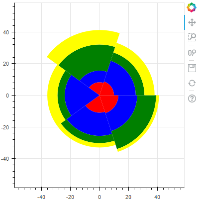
Now obviously that looks hideous. Its kind of hard to read and the color scheme leaves a lot to be desired. But with just a bit of extra bokeh magic, we can end up with something like the following
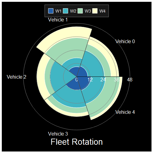
The code for that chart is seen below
p=figure(toolbar_location=None,background_fill_color='black',
plot_width=500,plot_height=500,
x_range=(-max_val*1.5,max_val*1.5),
y_range=(-max_val*1.5,max_val*1.5))

colors = itertools.cycle(ccycle.brewer['YlGnBu'][len(As)])

factor=2
ml=1
res=10
while res>5:
    res=np.ceil(max_val/(factor*ml))
    ml=ml+1
divisor=ml*factor

labels=[plbl*divisor for plbl in range(0,int(np.ceil(max_val/divisor)+1))]
lbl=['W1','W2','W3','W4']
VH=['Vehicle '+str(i) for i in range(0,len(As)+1)]

for i in range(0,len(As)):
    if i==0:
        p.annular_wedge(x=0, y=0, inner_radius=0, outer_radius=As[i], start_angle=Angle_Small,end_angle=Angle_Big,line_color='white', color=next(colors),legend=lbl[i])
    else:
        p.annular_wedge(x=0, y=0, inner_radius=As[i-1], outer_radius=As[i], start_angle=Angle_Small,end_angle=Angle_Big,line_color='white', color=next(colors),legend=lbl[i])

p.xaxis.visible=False
p.yaxis.visible=False
p.xgrid.grid_line_color = None
p.ygrid.grid_line_color = None
p.circle(0, 0, radius=labels, fill_color=None, line_color="grey")
p.text(labels,np.zeros(len(labels)),text=labels,text_align="center",text_color='white', text_baseline="top", text_font='helvetica')
p.text(0,-max_val*1.3,text=['Fleet Rotation'],text_align="center",text_color='white', text_font_size="20pt",text_baseline="middle", text_font='helvetica')
#p.axis.visible=False
p.ray(0,0,max_val*1.1,Angle_Small,color='black')
p.legend.location = "top_center"
p.legend.background_fill_alpha = 0.1
p.legend.label_text_color='white'
p.legend.orientation='horizontal'

vangle=[(Angle_Small[i]+Angle_Big[i])/2 for i in range(0,len(Angle_Small))]
vx=[max_val*1.2*np.cos(v) for v in vangle]
vy=[max_val*1.2*np.sin(v) for v in vangle]

p.text(vx,vy,VH, text_align='center', text_baseline='middle', text_color='white')

show(p)
Github Repo with the jupyter notebook code